Design
Although the root of journalism is the content and substance of the writing, the place where a story is shared and the design of that page is the soil and sun that makes it blossom and grow.
Click on the pages to take a closer look.
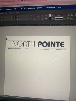
Redesigning North Pointe
At the end of my junior year, my team and I decided that North Pointe needed a new, fresh, and modern look. Over the summer I redesigned every page, from the front cover to the back cover. I created a new signature look, consisting of a new logo, an upgraded footer, a fresh cover design, and new fonts. I constructed templates for all 16 pages, delivering them to the Page Editors to use as a basis to make their work efficient and consistent, and so our new style translates consistently onto every page. I applied the knowledge I gained at MIPA summer camp and my own independent research of newspaper design to place every picture, caption, and headline in a purposeful and strategic location. Click through this slideshow to see some of the templates that I created.

The Process

I devoted countless hours during the summer working on drafts of new page templates to perfect North Pointe's new look. Eventually, I got tired of being cooped up inside on warm summer days, so I took my work outside to the backyard.

Constant revision and reviewing my work in hard copy was a must when making such drastic style changes. In needed to see how every font and all the small details looked once they were printed out.
I experimented with various styles, layouts, and fonts until I settled on the final product. Click through this slideshow to see the process of creating the final cover design.
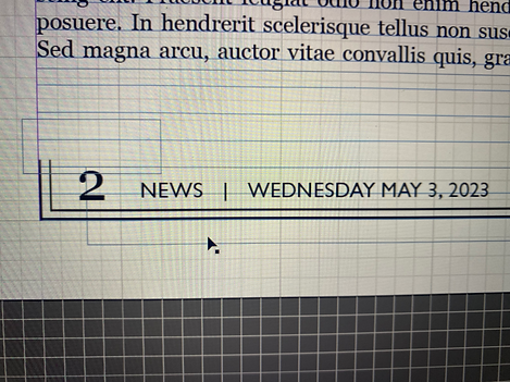
Getting the footer just right and transforming it from a header required a good deal of trial and error. I worked over dozens of redesigns, eventually deciding on using the logo in the design, which is a small detail I love.
Before and After


Before


After
November 2022

Website Masthead
The next phase of North Pointe's redesign was to update the website. I matched the look of our print masthead so we could have one cohesive style. I experimented with the "now" in different fonts and styles, but decided on the same font in regular instead of bold to present a clean look.
Page Designs

Cover
May 2023
I created this cover for the last issue of the year, also known as the senior issue. I am so proud of how this turned out, especially because I used two new applications for the first time. I created the postcard template with Adobe Illustrator and I put the pictures in using Adobe Photoshop. It took countless YouTube videos and many hours to get the hang of it, but I am so happy with the final product. I also got a drone shot of North for the background, and I think it compliments the postcard very well.

Feature Spread
January 2023
Since I was promoted to Managing Editor, I find myself helping others with their page designs more than working on my own. But in this particular case, the Features Page Editor was out sick, so I took over this spread. I love how clean and sleek the design turned out. The statistics on the right side are conveyed in a simple way, and not in a box, which allows the design to flow. The headline is incorporated inside the LGBTQ+ flag. The flag standing alone conveys the importance of the message and lends a sense of power to the story. This is a serious and important story, and my main goal was for the design was to not detract from that.
Cover
February 2023
In late December, my school was put under a 35- minute lockdown due to an active shooter threat. The lockdown was a very fearful time for many, as some locations in the school were not following traditional lockdown protocols, and of course, nobody knew what kind of threats were in our building. In this cover I wanted to capture the fear that students felt in the moment. We set the scene of students hiding in the corner surrounded by a chaotic mess. My favorite part of this photo is the shadows on the walls. I directed someone to hold up a flashlight behind the camera to achieve this. This picture successfully emanates the fear of the lockdown and is something each student in the school experienced, and understands completely.
.jpg)

Alternative Story Form
February 2023
I was so excited to work on the Alternative Story Form (ASF) for our February issue, while our ASF Page Editor was out. I do not get to work on many pages, and this brought back memories of the entertainment spreads that I created last year, and reminded me of how much I have grown as a designer. I wanted to capture the Valentine's Day feeling, so I went with a color scheme of pink and red, and created hearts on photoshop to spread around the page. The details such as the rounded edges of the photos, the lines underneath the text, the red headline and pink subhead pull the page together and achieve a free-flowing look.
Cover
November 2022
This cover was based on our feature story about the new school rules, which were imposed at the start of this school year. One rule involved the transition from paper to electronic hall passes. If the pass exceeded a certain amount of time, a student would suffer a lunch detention. In this staged photo, our Dean of Student Culture is filling out a lunch detention pass while looking at a student's E-Hall pass, which is well over the allotted time. The photo is staged in the ARK, which is where students serve detention. I paid particular attention to the lighting in this picture, turning off the overhead lights and letting the warm string lights tone down the photo. I put the focus on the computer screen, rather than the Dean's hand, so the new E-Hall pass could shine. I was so excited to create this cover with the new cover layout I created.


Entertainment Spread
May 2022
During the 2021-22 school year, I was the Entertainment Page Editor. One of my pages was the "On Pointe," a collection of the 10 hottest topics for each month. Throughout the year, my favorite part of each issue was creating a new design for this section. In previous years, each layout was the same every issue, but I wanted to move away from that. I created a new and compelling design each issue, usually spending hours sketching out ideas and experimenting with our software application, InDesign. This page was for our last issue, also known as the first issue of the summer season. My inspiration: bubbles. I know it sounds odd, but for me and many others, bubbles represent the start of summer. They were always the activity of the warm weather when I was a child, so I wanted to encapsulate that fun and playful mood into this page. The fonts and colors I selected also compliment the bubble design. I am very satisfied with the mood I created for the page, and this is the "On Pointe" I am most proud of.
Entertainment Spread
April 2022
In April's "On Pointe," I experimented with new shapes and design layouts. I wanted to go out of the box with this page, and ironically enough it resulted in a page full of boxes. I was aiming for a "magazine" look, so I drew up 10 different sized boxes with various photo shapes to achieve a page that is appealing and anything but boring. I made a bold choice, on the font selection - something creative that our paper had never used before. I had begun the year in a predicament each issue, in that I would turn all my images into cutouts, so I would not have a dreaded "boxy" page. But eventually I got bored of the cutouts and started to dislike the way they would "float" on the page. So this design was the perfect in-between. No cutouts, but through the different shapes and sizes of my photos, the photos do not make the page look boxy.

.jpg)
Entertainment Spread
January 2022
For the January issue, the "On Pointe" was the year in review. I knew I wanted to create a timeline, but I was not sure how I could fit the images in with the text on just one page. Therefore, I made a collage for the first time. I created a natural purple color scheme which I could incorporate throughout the page. This was my first time experimenting with shapes, which made this different than just another timeline. It was a challenge to fit 12 captions within the page, but I am proud of how I made it work. I remember seeing the final product printed in the paper and feeling so proud of how far I had come throughout the year, and in only 4 issues of being a Page Editor. This was also the first design for which I won a MIPA award, which makes it even more special.
MIPA honorable mention entertainment spread
The Power of the Process


Behind the final product of a page design is countless hours of hard work, printing drafts, and making edits. When an idea comes to me, I draw it out on paper and take to InDesign to experiment with the idea. First drafts usually end up wildly different than the final, but there is nothing I enjoy more than seeing a page come life, no matter how many stages it takes.
Behind the Scenes: Lockdown Cover

.jpg)
My initial idea for the cover featuring the lockdown news story was to recreate a barricade that many teachers made in front of their doors. But when doing so and taking the photos I was not satisfied with the message or the visual appeal. I experimented with students underneath desks but eventually decided on having three students sit in the corner, as they would in a lockdown. I took dozens of photos, changing the lighting each time. I wanted the main point of interest in this photo to be the shadow, so we held a flashlight behind my camera to achieve that. I also changed who was sitting on the right, so there was a white and green color scheme throughout the photo. Click through the slideshow to see the process.
Behind the Scenes: Valentine's Day ASF


I was looking at our Valentine's Day Alternative Story Form (ASF) on the day we were sending our pages to the printer, and i thought it was a bit too boxy and not festive enough for the holiday. Since our ASF Page Editor was absent that day, I decided to do a redesign of the page to fix the problems I was seeing. I marked up the changes I wanted to see on a printed page and started creating the final draft on the right.